jobs.nsw - web user interface design at its worst
by johna | December 1, 2011 | Web Design Web Development
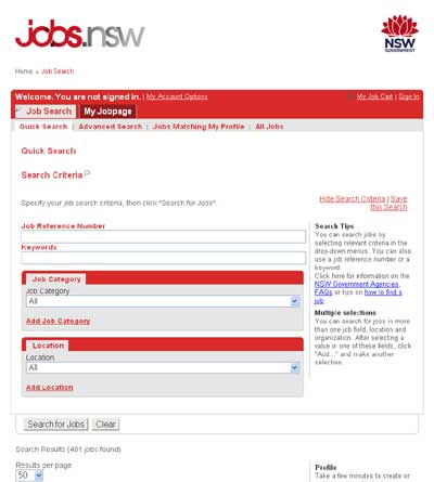
I was recently looking at the jobs.nsw job search page and was astounded at how such a high profile site could be so poorly designed.
The design is fine, my issue is with how it operates.

It's a dynamic site with AJAX and some animation of content areas appearing and disappearing. On some sites animation might be welcome, but this page's purpose is job hunting, and users like me don't want to wait while the search form disappears to make room for the search results which are displayed by AJAX on the same page.
Next problem, and this one is a big one. I get a bunch of search results and several of them are of interest to me. So I middle-click expecting the job details page to open in a new tab but it opens in the same tab. So I try right-clicking and select open in new tab. The new tab opens but I get a new search form, not the job detail page that I was hoping for and expecting.
So users are forced to view job detail pages in the same window, which means that we need to click back (browser button or hyperlink provided). This does take us back to the search results page and to give the developers some credit at least they coded in such a way that the search results and search form are populated with all the right details that were previously populated by AJAX - many developers don't handle this at all.
Personally, I generally avoid AJAX for search results as it is better for search engines to pick up content and allows users to bookmark search results pages.
Want more jobs.nsw usability problems? If I click on "job search" on the navigation bar it takes me to a page where I then have to click the big "job search" image which then opens the job search page in a new window.
I love sites that use lots of AJAX to avoid post backs, but they have to be (A) well designed, (B) quick (the AJAX on jobs.nsw is not fast), and (C) relevant to the content, not just AJAX for the sake of it.
Want an example of a good site with a lot of ajax, see stackoverflow. Leaving comments and answers on this site is such a smooth experience.
The design is fine, my issue is with how it operates.

It's a dynamic site with AJAX and some animation of content areas appearing and disappearing. On some sites animation might be welcome, but this page's purpose is job hunting, and users like me don't want to wait while the search form disappears to make room for the search results which are displayed by AJAX on the same page.
Next problem, and this one is a big one. I get a bunch of search results and several of them are of interest to me. So I middle-click expecting the job details page to open in a new tab but it opens in the same tab. So I try right-clicking and select open in new tab. The new tab opens but I get a new search form, not the job detail page that I was hoping for and expecting.
So users are forced to view job detail pages in the same window, which means that we need to click back (browser button or hyperlink provided). This does take us back to the search results page and to give the developers some credit at least they coded in such a way that the search results and search form are populated with all the right details that were previously populated by AJAX - many developers don't handle this at all.
Personally, I generally avoid AJAX for search results as it is better for search engines to pick up content and allows users to bookmark search results pages.
Want more jobs.nsw usability problems? If I click on "job search" on the navigation bar it takes me to a page where I then have to click the big "job search" image which then opens the job search page in a new window.
I love sites that use lots of AJAX to avoid post backs, but they have to be (A) well designed, (B) quick (the AJAX on jobs.nsw is not fast), and (C) relevant to the content, not just AJAX for the sake of it.
Want an example of a good site with a lot of ajax, see stackoverflow. Leaving comments and answers on this site is such a smooth experience.
Related Posts
Another pointless project - the programmable digital watch
by johna | January 20, 2025
I've come up with yet another pointless project. Would you like a watch that you could program yourself - but not a "smart watch"?
Converting dBase IV programs to run in the browser
by johna | September 13, 2024
Some pointless entertainment trying to get some old dBase programs running in the browser.
How to set up a debugging using the Turnkey Linux LAMP stack and VS Code
by johna | December 19, 2023
The second part in my guide to setting up a website and database using the Turnkey Linux LAMP stack.


Comments
by B | May 25, 2014
I hate this website with a passion for all the reasons you just stated and more.
In addition to that every job requires you to fill in tons and tons of unnecessary information and to write essays. There is a reason nobody else requires this of applicants.
Reply