Responsive collapsing search filters in Bootstrap 4

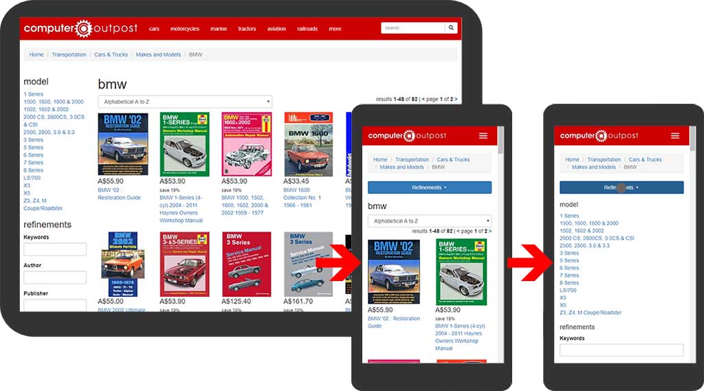
In responsive design there are times when on a mobile screen you want to hide some options with a button to show them, but on a large screen always show these options.
For example, a search results page with a bunch of search filters. On a desktop you might want those filters always visible, but on a small screen there might not be enough room and you don't want the search filters at the end of the page because the user would have to scroll all the way to the bottom to find them (they might not know they exist), and you don't want them taking up valuable room at the top of the page.
In these cases you want the user to see that filters are available at the top of the small screen page, and give them the option to show these filters with a button.
You can do this quite simply in Bootstrap 4 with a few classes.
In my example, I'll create a simple two column layout: one for search results and one for search filters. On large screens I want the search filters to be on the right side, but on small screens I want them to appear above the search results and be hidden.
So I'll put the search filters column first but use the "order-" classes to re-order them for larger screens (above md).
<div class="row">
	<div class="col-md-3 order-md-last">
		<!--Search filters-->
	</div>
	<div class="col-md-9 order-md-first">
		<!--Search results-->
	</div>
</div>
Next I'll add a button that uses the "collapse" feature and make this visible on small screens but hide on large screens.
<button type="button" data-toggle="collapse" data-target="#filters" class="d-block d-md-none btn btn-primary btn-block mb-3">Filters ▾</button>
And I'll create a DIV that will house my search filters and make this be shows and hidden by the button collapse, but always shown on large screens.
<div id="filters" class="collapse d-md-block">
	<!--Search filters-->
</div>
See the demo for full example code and see it working.
Demo
Related Posts
How to set up a debugging using the Turnkey Linux LAMP stack and VS Code
by johna | December 19, 2023
The second part in my guide to setting up a website and database using the Turnkey Linux LAMP stack.
How to set up a website and database using the Turnkey Linux LAMP stack
by johna | November 18, 2023
If you need to host your own website for the purposes of web development, Turnkey Linux LAMP Stack is an easy to install all-in-one solution that you can set up on a spare computer or a VM (Virtual Machine).
How I use the new Bootstrap Icons web font
by johna | January 7, 2022
But using a free online tool, you can create your own web font with just the Bootstrap icons you need.

Comments
by James | December 17, 2019
Great, thanks!
Reply