My blog updated to responsive design

For too many years my own blog has been out-dated, still with its' decade old HTML 3.2 markup. I decided to update it and put into action my responsive design techniques.
My intention was to make the layout as responsive as possible with just CSS floats, without JavaScript, and supporting as many browsers as possible, including right back to IE6. Then if the browser window size changed beyond what my layout was intended for, either smaller or larger, then certain elements would be show, hidden or moved.
The content area of my blog was designed to always be 600 pixels wide, unless the browser window fell below 650 pixels wide (600 pixels plus 25 pixel margins either side). Once below this point the content area should change to auto width to fill the browser window (with margins). Then I have another breakpoint to reduce the horizontal margins to only 10px when the display width falls below 620 pixels.
I also wanted anyone browsing full size on a 1920 by 1080 pixel monitor to make more use of all the available space. So I decided to have the comments element positioned to the right of the main content area at display widths above 1890 pixels.

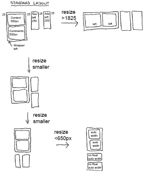
To accomplish the changes at the maximum width of 650 pixels and the minimum width of 1890 pixels I used my Cross-browser responsive design without media queries jQuery to apply different classes to the BODY element at these breakpoints.
This type of design is a simple way of doing effective responsive design without resorting to a more complex grid based layout. Basically my design uses fixed width building blocks which only become fluid when the browser width falls below the standard width of the main content area. To sum up here are some tips:
* Create fixed width elements
* Use CSS floats to position these items
* Add a media query (or equivalent) to change to fluid widths once the width falls below the width of your main content
Also in use is my Image resizing solution for Responsive Design which uses jQuery and server-side image resizing to request the correct sized image from the server for the current browser window size.
My intention was to make the layout as responsive as possible with just CSS floats, without JavaScript, and supporting as many browsers as possible, including right back to IE6. Then if the browser window size changed beyond what my layout was intended for, either smaller or larger, then certain elements would be show, hidden or moved.
The content area of my blog was designed to always be 600 pixels wide, unless the browser window fell below 650 pixels wide (600 pixels plus 25 pixel margins either side). Once below this point the content area should change to auto width to fill the browser window (with margins). Then I have another breakpoint to reduce the horizontal margins to only 10px when the display width falls below 620 pixels.
I also wanted anyone browsing full size on a 1920 by 1080 pixel monitor to make more use of all the available space. So I decided to have the comments element positioned to the right of the main content area at display widths above 1890 pixels.
To accomplish the changes at the maximum width of 650 pixels and the minimum width of 1890 pixels I used my Cross-browser responsive design without media queries jQuery to apply different classes to the BODY element at these breakpoints.
This type of design is a simple way of doing effective responsive design without resorting to a more complex grid based layout. Basically my design uses fixed width building blocks which only become fluid when the browser width falls below the standard width of the main content area. To sum up here are some tips:
* Create fixed width elements
* Use CSS floats to position these items
* Add a media query (or equivalent) to change to fluid widths once the width falls below the width of your main content
Also in use is my Image resizing solution for Responsive Design which uses jQuery and server-side image resizing to request the correct sized image from the server for the current browser window size.
Related Posts
How to set up a debugging using the Turnkey Linux LAMP stack and VS Code
by johna | December 19, 2023
The second part in my guide to setting up a website and database using the Turnkey Linux LAMP stack.
How to set up a website and database using the Turnkey Linux LAMP stack
by johna | November 18, 2023
If you need to host your own website for the purposes of web development, Turnkey Linux LAMP Stack is an easy to install all-in-one solution that you can set up on a spare computer or a VM (Virtual Machine).
Intermittent "Unable to read data from the transport connection: net_io_connectionclosed" errors
by johna | May 6, 2020
If you are having intermittent problems sending email in .NET using System.Net.Mail consider switching libraries.


Comments
There are no comments yet. Be the first to leave a comment!